No matter what changes lie ahead in online marketing and social media, this long-proven truth will always remain: You only have one chance to make a first impression. Dentists know this, psychologists know this, and advertisers do too.
We, advertisers, know that video is now the dominant conveyor of a brand’s value, story, and call to action. Stats on the value of video are everywhere you look.
Even those of us who refuse to believe the notion that modern humans have an attention span shorter than that of goldfish, understand we have no choice but to think in terms of seconds (five seconds, to be exact) when it comes to hooking our video audience. But before any of the big picture messaging can work any of its big KPI (Key Performance Indicator) magic, there is the first impression, the tiny picture: Enter the thumbnail.
Thumbnail Observations
This past week, as I’ve been browsing thumbnail apps and tutorials, and scrolling through dozens of thumbnails on YouTube, the following concept rings clear: No one will get through to —let alone get to— your perfect videos, unless you have compelling thumbnails!
Marketing is an art and a science. During a recent discussion at Chamber.Media, we dove into the “science-y” end of our work, applying the Laws of Attraction to video thumbnails. We found that video thumbnails that magnetize their intended audience contain and mix the following 5 elements:
- Human/mammalian faces/eyes/enticing images
- Emotive expression or gesture
- Great color and lighting
- Recognizable and consistent style
- Integrated well-placed logo
Thumbnails Illustrated
Let’s discuss the 5 elements of effective thumbnails.
1. Effective YouTube thumbnails contain human or mammalian faces and eyes and/or enticing images
Even our dear goldfish, with its 9-seconds’ long attention span, relies on eye contact. Oculesics (the study of eye contact and movement) has been around for decades and eye mapping studies are all the rage now. I’m not suggesting you spend your marketing budget on outfitting starving college student test participants with crazy goggles and wires, we do recommend paying attention to what eye mapping studies show. If eyes are windows to the soul, well…
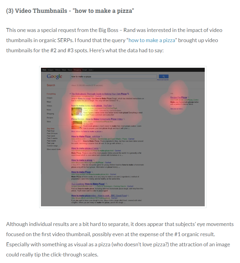
Eye-Tracking Google SERPs – Five Tales of Pizza. Source: moz.com Takeaway: Your pizza better be hot! Without a friendly Italian grandmother to relay your pizza message and call to action, you’ll need to work doubly hard to take or curate great photographs—and then post the most attractive images possible.
2. Effective YouTube thumbnails relay an emotive expression or gesture
This element is clearly linked to human faces, but doesn’t necessarily call for eye contact. Look at Adidas’ Creativity series. What words come to mind, beyond fierce, dedicated, unstoppable, and strong? Capture expressions or gestures like Adidas does in your thumbnails, and you’re gold!

Hint: Prior to any and all content development, list 3-5 key words that define your brand. When it’s time to shoot your video—or find content for your video coach your actors or seek actors that naturally express your brand’s message.
3. Effective Youtube thumbnails show attention to color & lighting
Whether you go minimalist or splashy, low-fi or high, color and lighting invite viewers into your world. Martha Stewart’s How-to-Cook series uses natural lighting so that eggs are white and red peppers are red.

Takeaway: Even if you aren’t selling hamburgers (or products people put into their mouths), consider how color can invite, encourage, warn, seduce, relax, or repel people.
4. Effective YouTube thumbnails display a recognizable consistent style
In its How-to series, Petco uses the same font, color scheme, format, and lack of capitalization—here’s a kitten, a dog, and a snuggly snake. This combination of design elements sets them apart from their competitors, PetSmart.


Takeaway: You don’t have to be born with great style to learn it. Do some research into the elements of style and then make sure yours gels with your clientele. Be as bold as NASA and create a style guide. Revise the guide as test results and feedback comes in.
5. Effective YouTube thumbnails incorporate logos organically
Your company probably spent a lot of time and money on its logo design, but in marketing video thumbnails, if a logo overpowers people, puppies, or how-to action, viewers scroll on. Customers care about what’s behind a logo—literally, in the video they may want to watch, and figuratively, in terms of how a product or service will help them.
Takeaway: Kill two birds—color and logo—with one stone, with this handy Color Emotion Guide. Play around with the location of your logo, making sure text or other content from the social media tool or channel you’re using doesn’t compete with, or block it out.
A Bonus Tip on Thumbnails
Video is teaching us, marketers, that time has never been more of the essence. The thinktankers at Think with Google are asking: “Is it time to start creating ads with the ‘skip’ button in mind?” and studies on optimal video length are everywhere. But, no matter if you are selling toilet paper or surfboards, it’s clear that thumbnails can make or break you.
We’ve given a lot of thought to first impressions, and I’d like to leave you with one final tip on video thumbnails: plan ahead. Many video marketers take a series of still shots before videotaping—rather than filming and then choosing a still from their roll. Sometimes this pre-planning results in a more focused message overall, but again, if your thumbnail doesn’t rock, no one will even get to your message.
Maybe you’re feeling slightly overwhelmed by the importance of the thumbnail. Relax though and think of that time you watched a nine-minute video of babies laughing…with that irresistible thumbnail!
