Possibly the biggest mistake in any development project is failure to plan. Recently, the owner of a prospective start-up told us that planning was unnecessary and a good developer could just start coding. This, I promise you, will end in tears.
 Wireframing is one of the first steps in your planning process and arguably it’s one of the most important ones. This is when the idea starts to take shape as an application, becoming boxes and buttons that users will interact with. This article will take you through a wireframing process; who should be involved, the tools to use and tips to enable you to make better wireframes.
1) Be Clear About Your Objective
As a developer I can understand the temptation to jump in and start coding. Often the initial idea seems so simple that surely you could just sit down and bash it out? Unfortunately, projects are rarely simple and anyone with experience will know what a myriad of unforeseen issues and challenges await you if you go down this route.
A wireframe will help you identify many of these issues in a way that is time and cost effective. It is far easier to make changes to a collection of paper screens than after you have written a thousand lines of code.
The process also helps to create a better understanding of the application. Putting it down on paper raises questions and ideas and leads to changes.
The final output will be a blueprint from which designers, developers, architects and project managers will work and makes sure everyone is in sync.
2) Make it Functional, Not Pretty
There are variations in how wireframes are presented and this is reflected in the various tools available. Fundamentally it is about the functional parts of an application, e.g. that a page will have 3 text boxes and 2 buttons. It’s about function not form.
At Vertical Sight we take an austere approach to this and our wireframes include nothing but the functional elements (boxes, buttons, dropdowns etc). We ignore anything that could be seen as design or layout. Others may go a little further and include layout and other visual elements. Whatever works for you.
3) Draw on Your Experience
You do not need skills in design or development. All anyone needs is experience in using web apps or websites. Of course the more experience the better but you don’t need to understand relational databases to wireframe.
4) Decide Who’s in Charge?
Make sure someone owns the wireframe process. They are responsible for keeping it up to date and managing feedback, changes etc. In the case of a start-up this is often the founders, the ones with the idea and vision who understand the end goal. In the case of our clients we often take on this role. It doesn’t matter who it is so long as ‘someone’ is in charge.
5) Involve Everyone
Maybe not at the first meeting, that should focus on simply getting the idea on paper and involve the key stakeholders whose idea it is. Fewer, people involved makes this process quicker. As the wireframe develops involve other members of your team and your client’s team. For example, if you are integrating your app or site with existing databases then make sure the DB owner can check that all the data fields exist in their database before you add them to your wireframe. Collecting a user’s fax number is no good if there is nowhere to store it. Equally designers have a good understanding of user experience and can spot potential problems in the flow early on.
6) Set a Deadline for Completing the Wireframe
It is important to set aside predefined periods of time and deadlines for deliverables to keep a project moving. The initial wireframing session could be one day or several depending on the size of the application. But set a period and stick to it. Follow up review meetings can be much shorter or even done remotely.
7) Keep it clean
If a particular page requires two text boxes and a button then it should have just that, no more, no less.
8) Avoid Designing Your Wireframe Too Much
Wireframing is about the functional way in which something operates it’s nothing to do with presentation or design. We try to avoid anything that could be construed as design. This will almost always distract the audience. Add a little blue just to try and make it more interesting and you will have a half an hour conversation about the merits of blue. Design should be left to designers.
9) Remember that UI is not UX
It can be extremely tempting to start thinking about the use of presentation methods such as AJAX. Remember that a wireframe document is about the functional elements and not the way they are presented or users interact with them. For accessibility reasons applications need to work without features like AJAX and therefore more like the wireframe.
10) Think About the User
It sounds obvious but it’s so easy to get caught up in creating a wireframe and forget about the user. The functional is what we’re focused on but it is still important to consider the user experience that is being created. For example, if you create a registration form that is three pages long you probably won’t find that many people fill it in.
11) Don’t Get Lazy
It’s often easy to say “the login page is obvious let’s not include it in the wireframe”. Make sure you wireframe everything. At the end of this process you should have a document that can be stepped through just like the final website. Every step counts and none should be ignored.
12) Organise Your Wireframe into Sections
A website or app is often divided into sections such as news, products and user account. Break up your wireframe document accordingly for much easier reference.
13) Number Your Pages
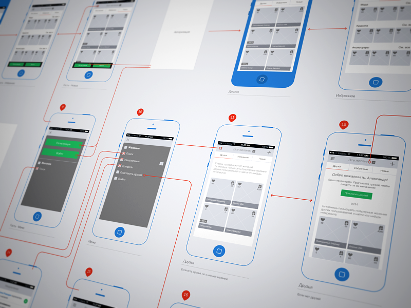
A web application often consists of a number of processes; a checkout is a good example. Often these are linear but sometimes users can choose different paths such as skipping a step. Clearly number the pages in your document and then label which page a particular action (such as clicking a button) takes the user to.
14) Look for Repetition
Consistency within an application is helpful to users, developers and designers. Repetition of groups of elements can therefore be a good thing. For example, wherever a user enters an address it should be the same fields in the same order. Look for these areas of repetition as you wireframe.
15) Check it all Makes Sense
The final document should be easy for anyone to follow. If only a developer can understand your wireframe then something has gone wrong. Ask at least one person who has nothing to do with the project if they understand it.
16) Ads are Functional
Many sites include advertising for monetisation, this may be as simple as Google ads but it is functional and not design, so include it.
17) It’s Not Just the Public Site
Many sites have an administration area for managing content, viewing registered user profiles, resetting passwords etc. This may not be viewed by many people but it is still important. Sometimes it can contain data that is not publicly available (such as a user account enable button). This is important information to developers when designing the database.
18) Know When to Stop
Make sure all relevant stakeholders have the opportunity to give feedback but don’t turn this exercise into painting the Sistine Chapel. Typically I would say three drafts should get the job done. The first gets the idea onto paper. The second reflects feedback from other parties such as developers, and designers. The third should be the final polish.
19) Choose the Right Tools
Pen and paper is often the way to start. It is much easier and faster than using a computer and lets you get thoughts and ideas down as the concept evolves.
Once you start creating the document our advice would be to use the tool you’re most comfortable with. Developers for example may use Microsoft Visio, project managers PowerPoint, Designers Adobe Fireworks.
I think that the wireframe should be a document though rather than something interactive (like design, it can be a distraction) and therefore creating HTML may not be the best thing.
There are a number of specific tools for wireframing, for example Balsamiq provides an environment for quickly adding and customising common interface elements. They have given it a hand drawn feel to provide a visual lift while not actually being design.
20) Consider Dependencies
Everyone knows what a shopping cart process is, right? Therefore it’s easy to wireframe and put to one side. Not entirely. What if you’re using a third party payment provider such as PayPal? That may influence how parts of the site must work. Research the areas where there will be dependencies and make changes accordingly. It’s easier to do it now than later.
Hopefully this article has provided a clear sense of the wireframing process, who’s involved, how to approach it, the tools to use and what the final output should be. The most important thing to remember, however, is that a thorough and well put together wireframe can save you a lot of time later in dealing with issues later on down the line.
Do you have any tips for creating great, usable wireframes fast?


